Mastering IELTS Line Graph Analysis


Contents:
- What is writing task 1?
- The marking criteria
- Think, then write
- How to answer writing task 1
- Other resources
What is writing task 1?
IELTS writing task 1 consists of summarising some visual information in at least 150 words. The visual is usually a graph or chart. Your key tasks are to pick out the main features and describe and compare the given data. Most important with task 1, is to be clear and effective in your response. As with writing task 2, there is a structure that needs to be applied. This article will go through this in the most direct way possible.
The marking criteria:
- Task achievement
- Coherence and cohesion
- Lexical resource
- Grammatical range and accuracy
Ask yourself the three questions:
- What can I see?
- What stands out?
- What is the relationship like between the data?
The key here is to simplify. It’s not surprising that many visual forms of data look complicated and intimidating. The key to simplifying the task so you write as effectively as possible, is to spend time studying the graph before anything else. Simplify what you can see, apply the structure and write clear and effective sentences. Lots of students think task 1 doesn’t need much practice because you’re only summarising a graph. It needs just as much practice as the other papers.
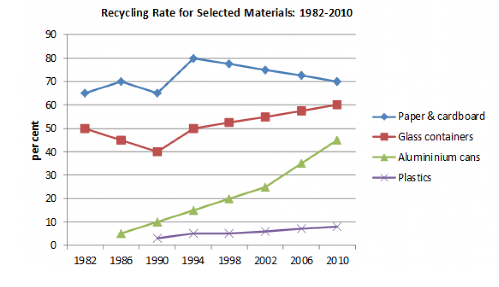
Let’s take this line graph as an example and apply the three questions. Bear in mind that these are just notes and an opportunity for you to understand the data you have been given and begin to apply this understanding.
- What can I see- four lines each representing a material. Plastics remains low, aluminium starts low but climbs, glass is generally steady and paper fluctuates
- What stands out- aluminium starts low but picks up a pace and has a steep climb, glass starts quite high, dips and then keeps a steady growth, paper has the most varied of journeys as it fluctuates the most
- What is the relationship like between the data- plastics have the lowest rate of recycling. Aluminium and plastic share a similar start but then have a significant contrast as time goes on. In comparison to both plastic and aluminium, glass and paper have a higher recycling rate overall. Glass and paper start at similar percentages and also take a dip in the same year of 1990, then both increase four years later. From here, glass looks like it's steadily increasing and paper is decreasing.
The graph below shows the proportion of four different materials that were recycled from 1982 to 2010 in a particular country.
How to answer writing task 1 checklist:
- Paraphrase
- Overview
- Paragraphs
- Check.
Paragraph 1- Paraphrase
The graph below shows the proportion of four different materials that were recycled from 1982 to 2010 in a particular country.
- The graph represents the proportion of four contrasting materials that were recycled between 1982 and 2010 for a particular country.
- Chart illuminates the quantities of four varying materials that have been recycled in 1982 and 2010 in an unknown country.
A is the better paraphrased statement to open your response because it has the same meaning as the given statement. Whilst it's good to use different lexis (words), you don’t want to do so to your detriment and skew the meaning which actually, would lower your score.
The problem with statement B is;
-’illuminates’ is the wrong word to use. We are given information that is factual, so it isn’t entirely appropriate to describe the information as ‘illuminating’
- ‘quantities’ is the wrong word to use. Quantities implies a collective and a total, whereas proportion is part of something in comparison to its whole
- ‘in 1982 and 2010’ has a different meaning to ‘from 1982 to 2010’. The first implies two different sets of data, whereas ‘from’ denotes a span of time.
Paragraph 2- Write your overview
This is where you talk generally and mention the key features. You don’t need to specify details of the data and cite these. So you’re overview would sound like this:
Overall, plastic has the lowest rate of recycling although it appears to be on a slow increase. Aluminium cans have been represented with a positive trajectory, as they continue to increase over time. Glass containers as another recyclable material, despite its dip in the 1990’s, is set to continue its growth. Paper and cardboard seem to have the most early success, though begin to take a decline in the mid 1990’s.
Your overview is so important. Without a clear overview, it is difficult to score a 7 or above. It is a summary of the most important points and sets up what you will explore in more detail, in your more detailed paragraphs.
What the examiners want you do in your overview is:
- Summarise the information by selecting and reporting the main features
- Make comparisons where relevant
Without an overview, you will always be marked below a 5. If you appropriately select data in your opening, you receive a 6, if it is ‘clear’ you receive a 7 (for this part of the exam).
Paragraph 3 & 4- Detail paragraphs
What differentiates these paragraphs, I hear you say. All this means is separating your analysis. The graph, pie chart, line graph etc, will present layers of information. Structure this into your two detailed paragraphs.
I would suggest marking this in your paper in your thinking/planning stage. Make a clear divide where you know you will discuss the earlier patterns, and then the later patterns. This will show the examiner that you understand structure and have considered this in your response.
4. Check your work
Check your work with these questions:
- Are my key features correct?
- Is my paraphrasing clear?
- Is my overview clear?
- Are my detailed paragraphs accurate?
- Is my grammar precise?
- Is my vocabulary valid?
By knowing you have achieved these, you can expect to get the grade you deserve. You will also know that your structure is in place; paraphrase, opening, detailed paragraphs.
Other resources
A good place to practice for writing task 1 is The Economist’s daily share of charts- ‘Graphic Detail’. Having said this, this is something you graduate onto. Start with old questions on the British Council’s website first. You can even type into Google, ‘graph’, or ‘chart’ and practice with these. Once you feel more confident and have had feedback, try using Graphic Detail.
Final notes:
- Keep practicing and always factor in time to study the given data for five minutes. Make this part of your practice.
- Always get feedback on your task 1 responses. It’s important to have feedback to know where you can improve and apply this feedback.