IELTS Academic Writing Task 1


IELTS Writing Task 1 Sample
I came across a post from someone on Reddit, who shared a question they found difficult. I understood why and wanted to share a post on how to tackle this.
Let’s say you don’t get a graph, bar chart, pie chart, line graph, scatter graph, area chart, dot graph, etc, but instead you are presented with a more unusual visual data like the one here.
Do your tactics for writing task1 change? No.
Should you abandon the revision techniques you learnt? No.
Do you employ a different language to evaluate? No.
Do you change the structure? No.
Using my simple check method (the one which IELTS examiners look for in your answer), apply the writing task 1 structure and ask yourself the three questions.
Questions:
- What can I see?
- What stands out?
- What is the relationship like between the data?
Writing task 1 structure:
- Paraphrase
- Write your overview
- Write your detailed paragraphs
- Conclude
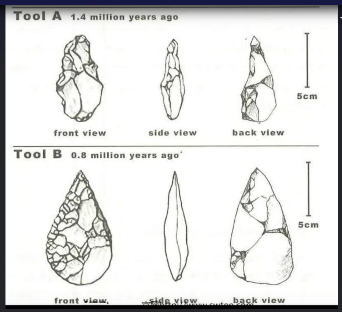
The diagram below shows two rock cycles over a period of time. Summarise the information given to you in no less than 150 words.
Introduction:
The diagram presents a comparative view of two rock types, and their evolutionary change over a monumental period of geologic time.
Overview:
From first inspection, we can see that Tool A is of an entirely different rock than that of Tool B. Tool A appears to be a more craggy rock which characterises it throughout its ageing. Tool B on the other hand, takes on a pearl-like shape, opposing the roughness of Tool A. Overtime, we can identify how Tool B developed a more consistent shape, and can assume that this is perhaps due to weathering and how it evolved with its environment. Whilst tool A’s inconsistent corrugation could be representative of the early stages of rocks being used as everyday tools.
Detailed paragraph 3 & 4:
On closer inspection, we can see that tool A appears to have more dents, chinks and is more rough-textured than tool B. It’s front appearance is much more bulbous with ridges than the otherwise flatter looking front view of Tool B. Having said this, Tool B’s front view is detailed with pockets of condensed cracked rock that sit tightly together. Their respective side views also differ. Tool A appears to have a more crinkled top and wider birth at the bottom, whereas Tool B is much more streamlined and near enough holds the same shape from top to bottom. We can perhaps elude that this change over time eludes to the idea that it became a more efficient tool altogether.
The final view that we see, the back view, again presents a distinct difference. The tool is far wider and has a greater surface area with some cracks and fragmented parts, but it is more evolved than its counterpart. The wider base perhaps signals the evolutionary need for humans to hold the tool in an easier manner and make better use of its sharp peak. Whilst there are some similarities between the two, we can see from Tool A’ back view that it appears folded in at points with its craggy appearance and juts out with sharp edges as well as inverted parts.
Conclusion:
Overall, although the sizes are the same, being 5cm, Tools A & B appear vastly different across their time-span. Tool A could represent a less evolved rock that at that point, had had less interaction with humans. Tool B however is larger and takes on a more consistent shape that implies a relationship between the tool and humans, changing and improving its usage over time.